Death cross in S&P 500: What does history really say?

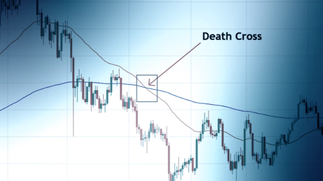
The S&P 500 recently formed a so-called “death cross” – when the 50-day moving average crosses below the 200-day moving average. This technical pattern often receives a lot of media attention and is interpreted as a warning signal of a potential bear market. However, historical data shows that this signal is not always as scary as it sounds.
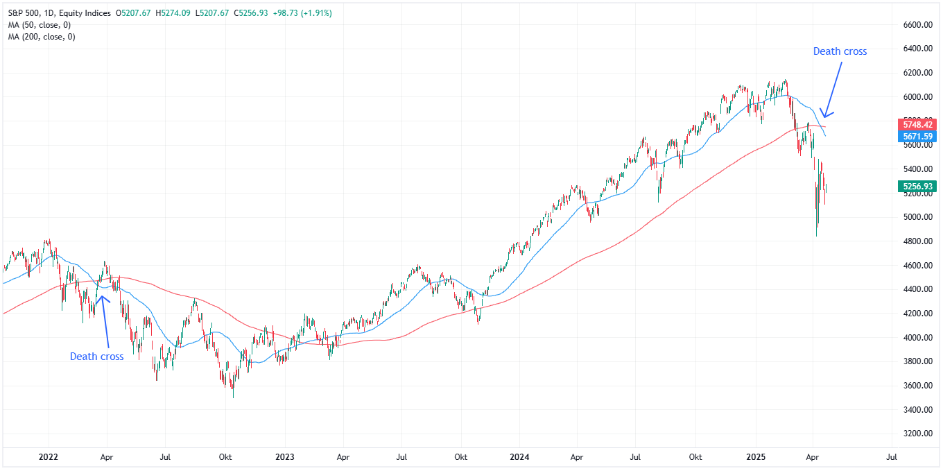
Here we see examples of a pair of death crosses in the S&P 500.
Distinguishing between noise and signal
As a systematic investor, it's important to distinguish between what sounds good in the media, opinions from social media gurus, and what actually works in practice. It's not always easy – especially if you lack the tools, experience, or a clear strategy to lean on.
Death cross belongs to the first category – a signal that is easy to understand and build headlines around, but which does not provide any statistical advantage.

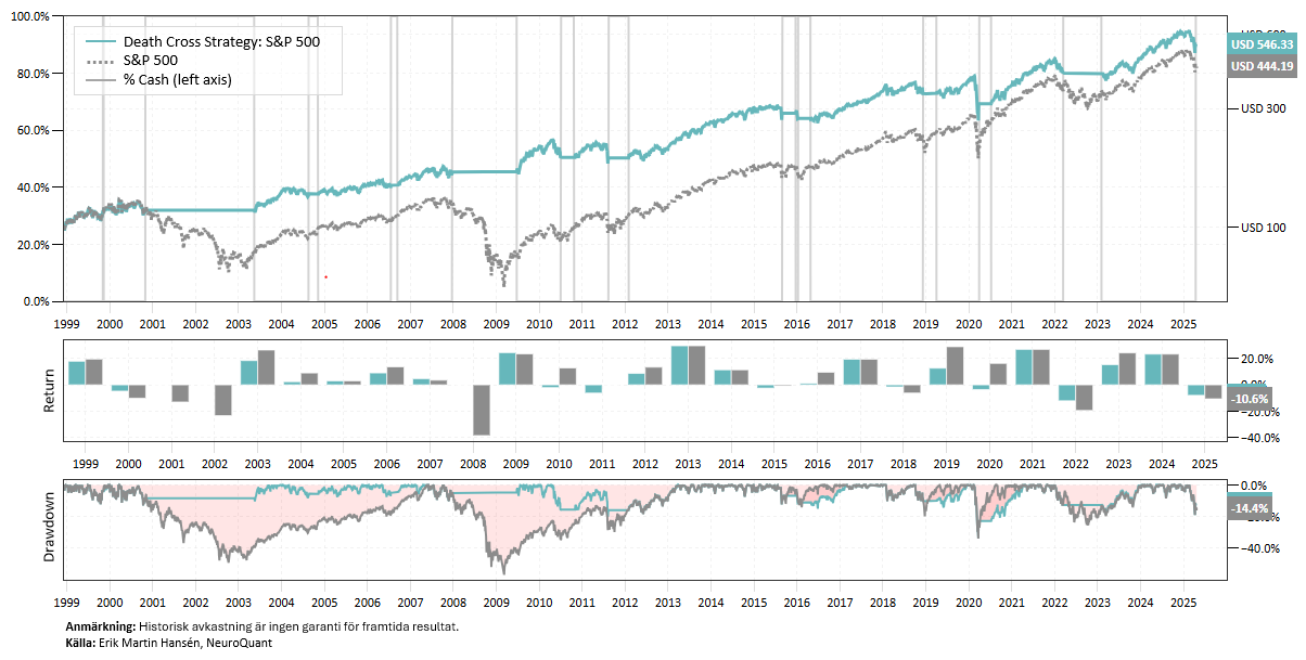
Backtest Death Cross
Let's backtest the signal!
Since the late 1990s, a strategy that played on death crosses (when the MA-50 crosses the MA-200 from above) and golden crosses (when the MA-50 crosses the MA-200 from below) has had a Sharpe ratio of 0.49 – compared to 0.30 for a pure buy-and-hold strategy. The maximum decline has been -34%, which compares to -57% for the S&P 500.
The statistics thus look somewhat better than for buy-and-hold, mainly thanks to the strategy staying out of two major bear markets: the dot-com crash and the financial crisis. However, since the financial crisis, the strategy has underperformed the index, as sell signals often coincided with bottoms in the S&P 500.
Conclusion
In conclusion, there is no reason to be scared by a death cross signal. It is certainly positive that the strategy stayed out of two longer bear markets – but so are all signals that capture long-term trends. With a Sharpe ratio of only 0.49, we know that there are much better methods for managing risk and timing.